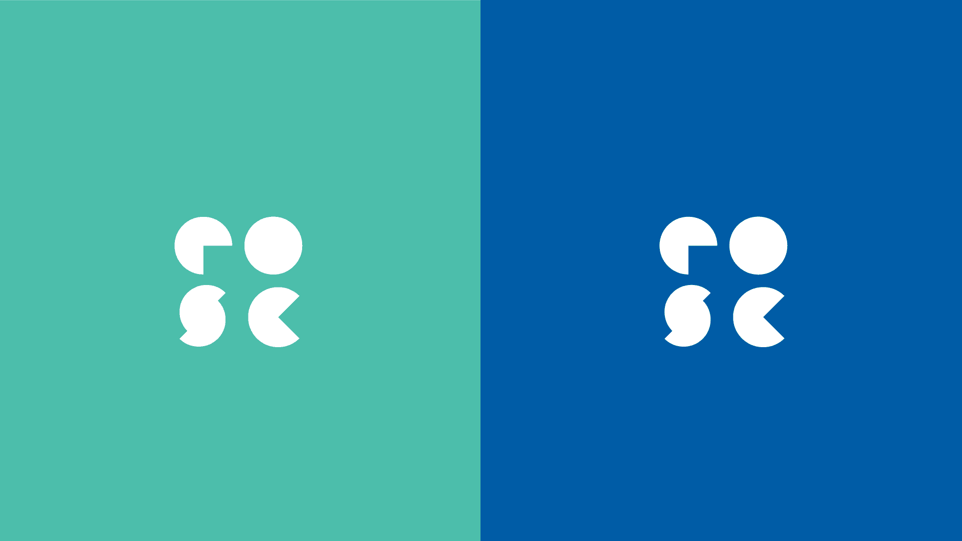
EOSC
Year
'24
Client
Framer template
Service
Brand design
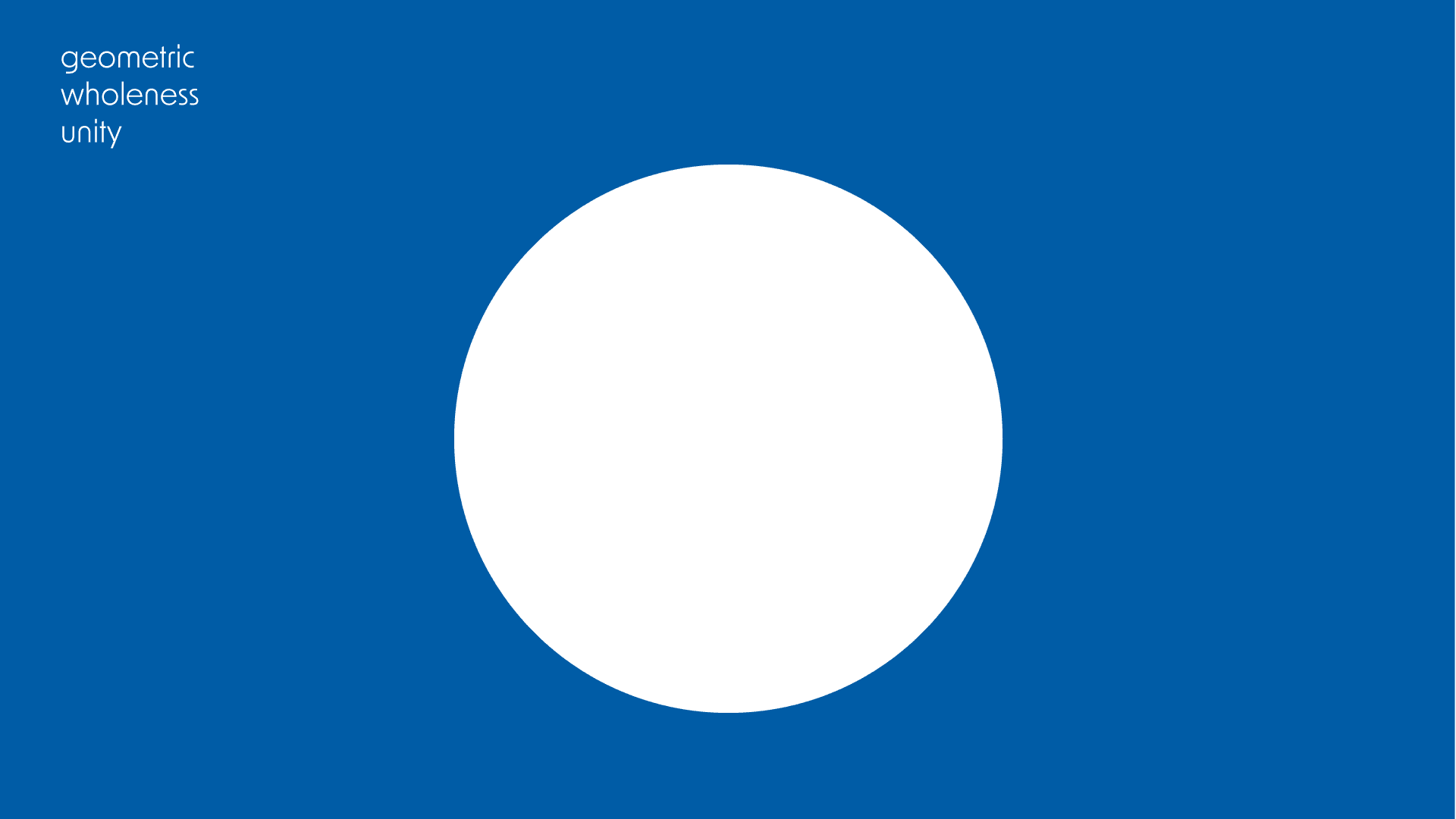
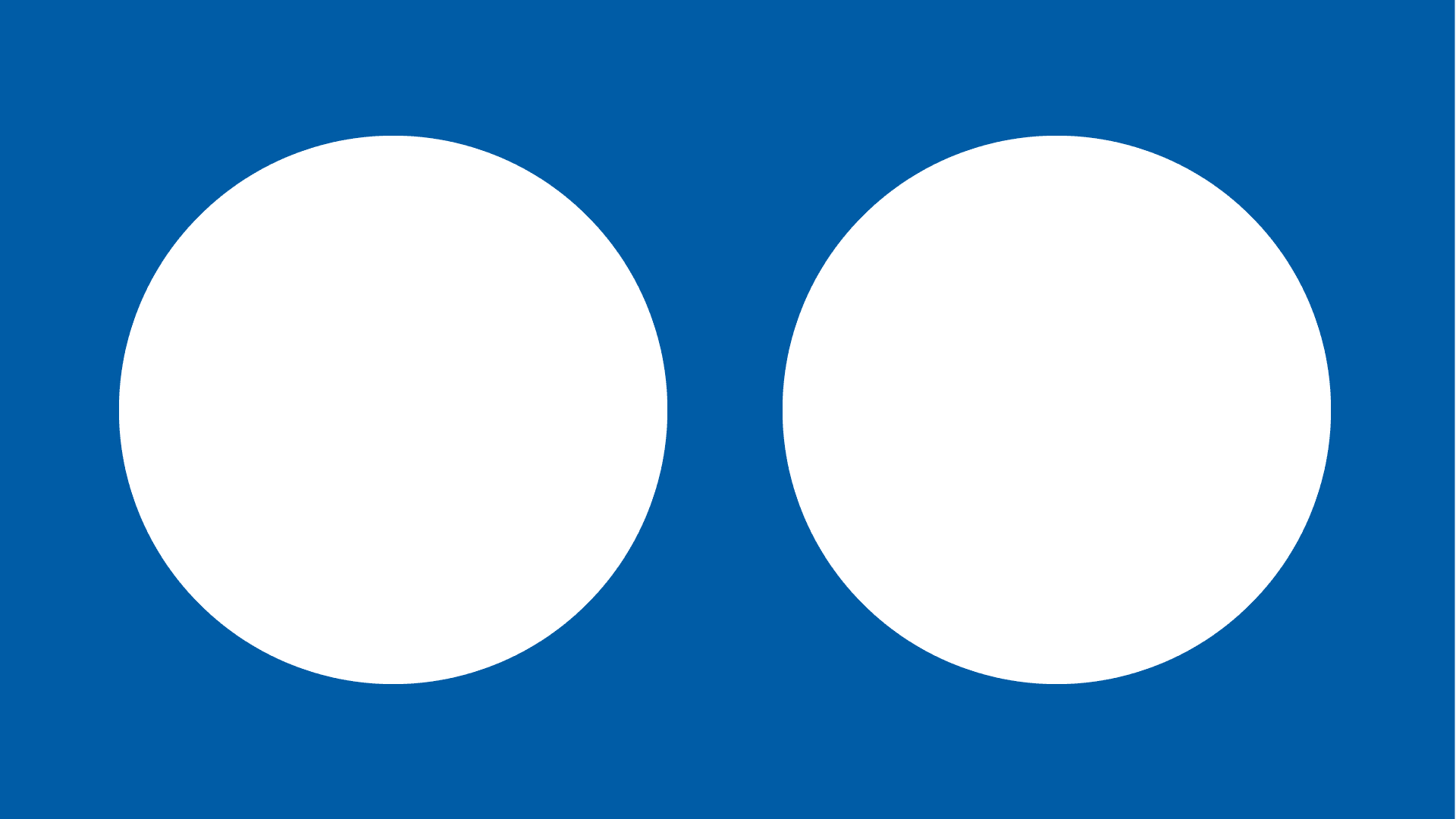
This brand identity for the European Open Science Cloud is built upon the arrangement of simple geometric forms. The forms reference cells, atoms, and processes of splitting, multiplying, and building, whilst a restrained colour palette gives the identity a contemporary European feel, balancing clarity with a sense of precision and openness.


Challenge
Translate complex ideas around open science, shared infrastructure, and collaboration into a clear visual identity.
Scope
The logo system uses abstract geometric forms inspired by cells and atoms to suggest connection, growth, and exchange without relying on literal scientific imagery.